
Tags that this post has been filed under.
We are totally desensitised when it comes to visualised information, to the point where we take standard formats for granted and rarely question why we started using them in the first place. Pie charts are certainly among the most commonly used visual tools that present proportions of certain categories in the whole in a straightforward and obvious way. They can be found literally everywhere, from mainstream news reports to corporate power point presentations, stretching the silly food metaphor to extremes. We are so familiar with this format that we rarely stop to ask objectively – does it really do the job it’s supposed to? Why pies at all, and not another paradigm?
Is there a more efficient format out there?
As it turns out, many data visualisation pros believe that pie charts have outlived their usefulness and need to be eliminated from the business arsenal. This opinion may be surprising, but it’s rooted in some very logical arguments that cut into the core of what visual communication should be all about. To understand both sides of the argument fully, we need to look more closely at how pie charts are usually perceived by those they are intended to inform and engage.
The case against pie charts
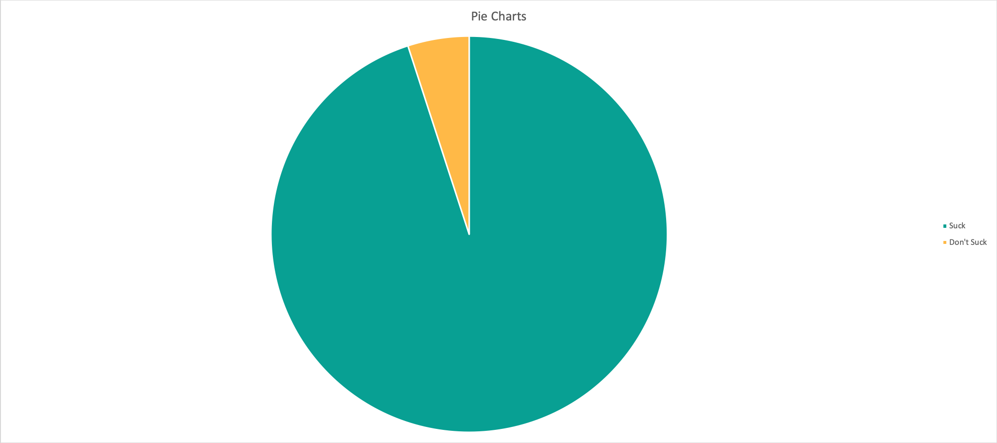
The most obvious problem with pie charts is the requirement that the viewer makes a visual comparison between ‘slices’ of different sizes. That works well when you have only a couple of slices that are of different orders of magnitude, for example 75% vs. 25%. Differentiating between numerous, similarly-sized surfaces is a much more challenging task for the eye, and it often can’t be calculated instantly which is necessary for effective visual communication.
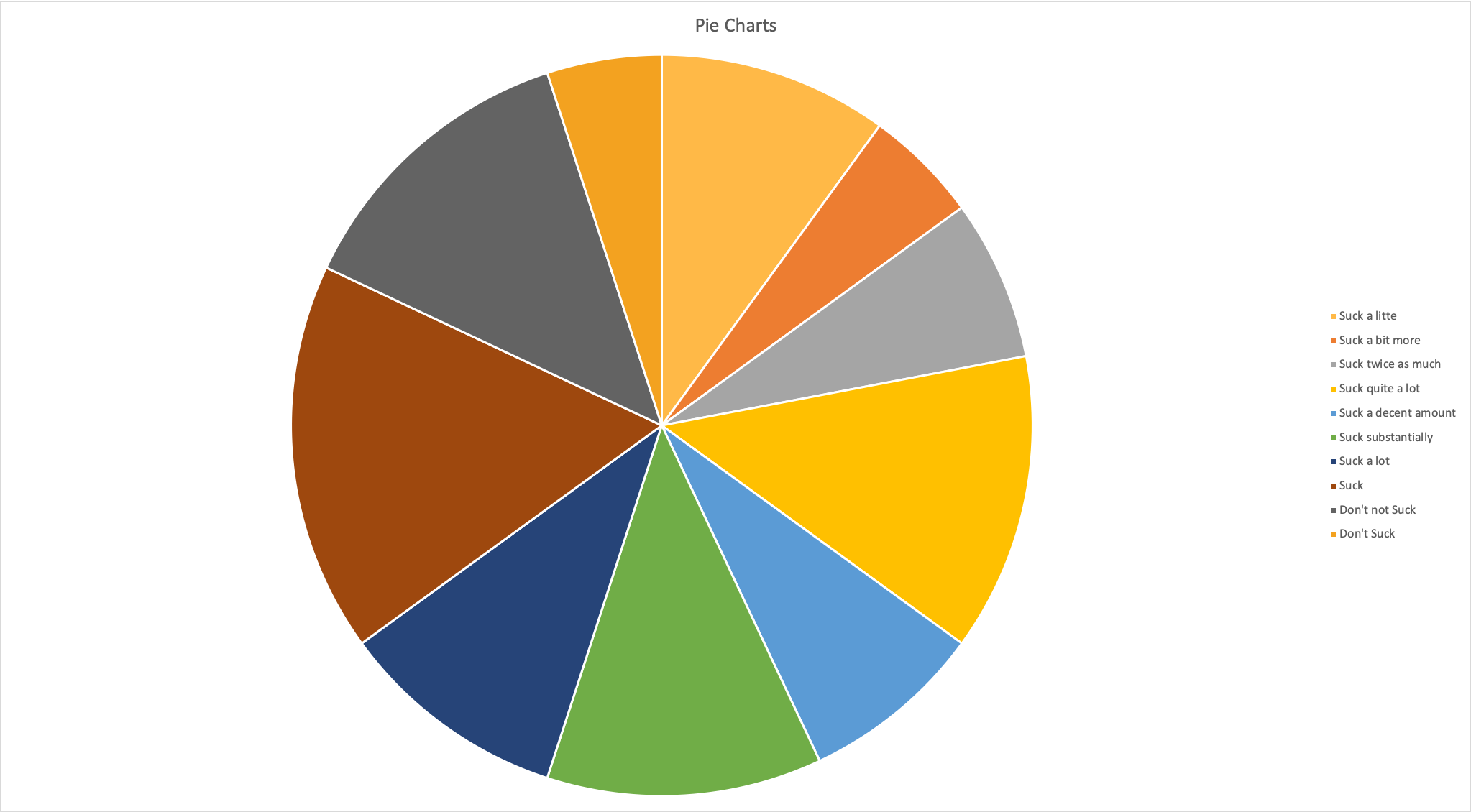
There is also the matter of available space – in order to make the pie chart readable, it needs to be vast and that often comes at the expense of other potentially useful details. The legend also needs to be intelligible, requiring additional space and complicating the layout. Another issue is the static nature of this representation and absence of any relationships between categories. Pie charts fail to capture processes very well and at best represent snapshots frozen in time, without any mechanism to explain the interactions between the represented factors/categories. Finally, the definition of categories is often arbitrary and allows for easy manipulation of the main message, for example by bundling a couple of smaller slices together to create a dominant slice while keeping all other factors highly granulated.
Possible alternatives to pie charts
Replacing pie charts wouldn’t be particularly difficult or harmful, as there are many other visual formats that could more readily express proportions. To begin with, a simple bar chart or slightly more sophisticated stacked bar chart can probably accomplish more than the traditional pie format.
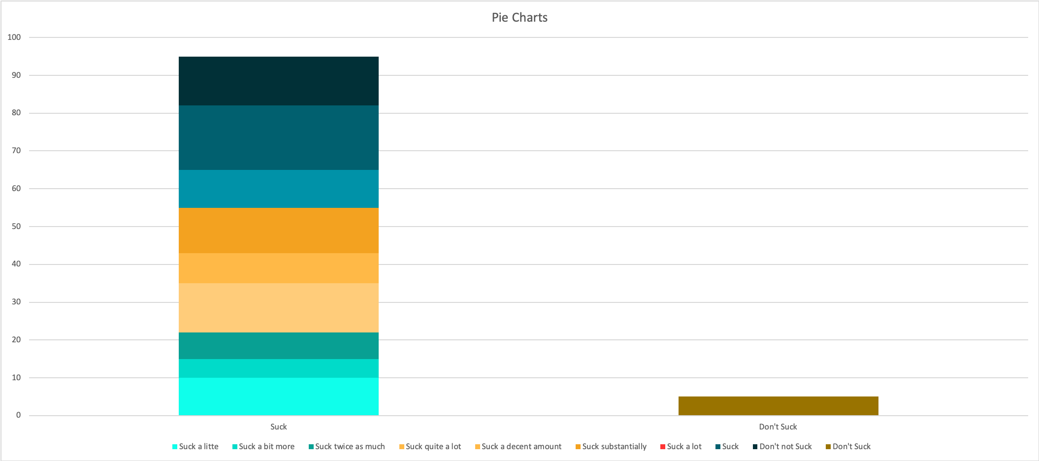
By reducing the visual metaphor to a single dimension, the comparison becomes more organic and more natural, eliminating odd angles and strangely-shaped surfaces from the picture. If you want to get more creative, you can use stacks of differently coloured dots or squares (so called ‘waffle chart’) or a similar format that allows for an instant understanding. Of course, if you need to show a continual process, there are several types of graphs and curves that could capture the essence of a trend much more subtly. Basically, instead of settling for a standard format and using it indiscriminately, it might be more appropriate to choose any of the aforementioned options based on the structure of the data and the purpose of data visualisation.
In the defence of pie charts
Despite all the criticism, pie charts refuse to die so it’s fair to consider which qualities afforded them such longevity. The truth is that pie charts are very simple to make and thus can be used by people with minimal visualisation skills and minimal time to create the graphics. They also impose a colourful image that’s hard to ignore, so if you are facing a choice between a pie chart that draws the attention of a senior manager and a slicker visual that goes unnoticed you might as well go for the former. There is some value in familiarity, and even the least data-friendly decision makers are comfortable with this format. It may be possible to use it effectively if you are fully aware of its shortcomings and try to formulate pie charts that are not overly complex and that express the main ideas clearly.
What should you do about pie charts?
Knowing all this, any business organisation faces a dilemma whether to ban pie charts totally or to allow them in certain contexts. The answer probably depends on the type of organisation, as more data-driven businesses should have enough capacity to come up with more sophisticated data visualisation techniques. For others, gradual transition away from pie charts would be a more viable option, as it might take some time to develop better habits. The important lesson is that no data visualisation tool should be used without careful examination of its effectiveness, especially in the era when we have plenty of means on our disposal to communicate quantitative data effectively.