Tags that this post has been filed under.
If you think that you need advanced design skills and specialised software suites to communicate information in a visual way, you are wrong. In fact, a huge chunk of most effective visual content is very simple and can be created with programs that everyone has on the desktop, including Microsoft Excel. You're likely to have produced charts in Excel, because it makes it relatively effortless to do, which is great!
This is not to say that every Excel chart is a good data visualisation vehicle, far from it. We’ve all seen a bunch of terrible graphics made by people who wanted to make an impression but didn’t care to learn the fundamentals first. Here are a few nuggets of wisdom that could help you avoid some of the traps of bad chart design and produce solid Excel graphics with very little effort:
Choose the right chart type for your content
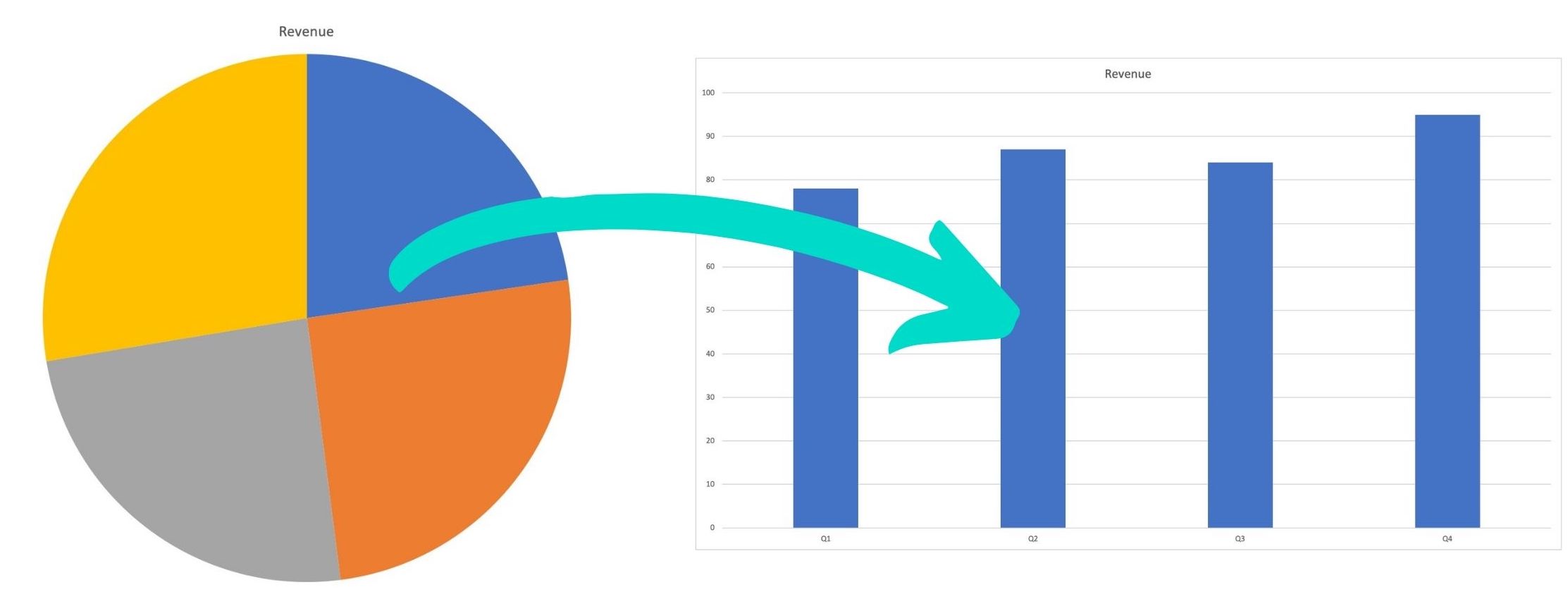
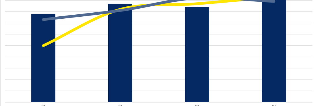
You can make several different types of charts in Excel, so picking the format is the first step you have to make. Most beginners try to visualise their data with a pie chart, but this is probably the worst decision you can make as this type of chart is not very user-friendly and requires a lot of attention to read and interpret. Read why Pie Charts Suck here. Line charts or bar charts work much better, and you can also use a stacked bar chart to demonstrate processes and growth over time. The merits of each type of chart should be evaluated based on the nature of information behind the numbers, and you should choose a format that allows you to express the main points clearly and unambiguously. If you are inexperienced with this type of work, a good start is to test different chart types and see which one jumps off the page with sample numbers. Once you gain some experience, you will be able to immediately understand which format gives you the best chance to get your points across.
Stay on brand with your colour and text selection
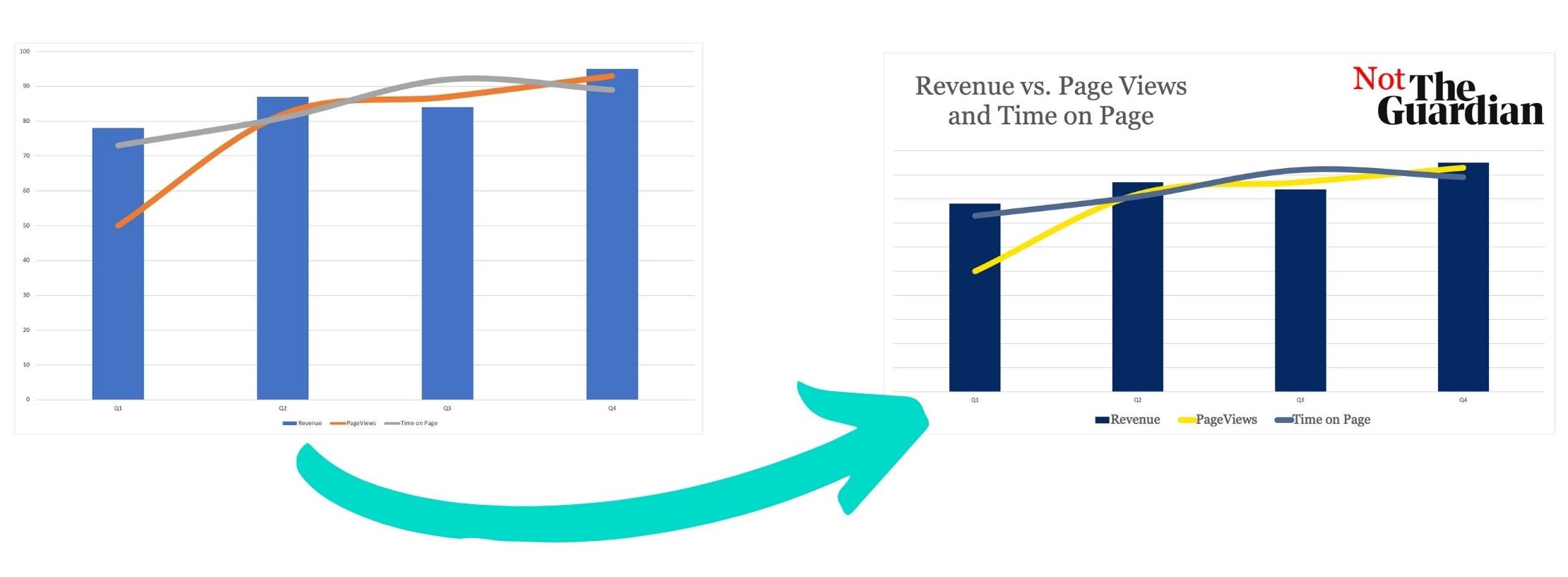
Consistency is crucial in visual communications, and using the same set of colours associated with your brand in real life can make your Excel presentations more memorable and more relatable. A common practice is to use the exact same hue from the logotype as the primary colour that dominates the presentation, while adding a few secondary colours for contrasting elements. If you standardise the use of colours in this way, your Excel documents will look more professional and will be readily identified as official reports from the company. It takes some discipline to apply this rule in all situations (particularly in larger companies) and some creativity to get the most out of this colour combination, but we are talking about basic stuff here. Even companies with minimal technical expertise should be able to enforce this policy across all of their documents, including data charts and tables.
Add legends to contextualise your charts
After spending hours looking into the numbers, you will develop an understanding for what they actually mean but people who see the chart for a few seconds won’t have the same luxury. They need additional pointers to quickly wrap their minds around the presented information, and this is partially the role of the legend. By labelling your charts accurately and succinctly, you can significantly improve their impact and help your audience have a better experience. Again, you should carefully think about the objectives of the presentation and the real-life phenomena behind the numbers when deciding how to verbalise what the data represents. It is clear that only short text can work well as the chart legend, but exactly how detailed the explanation should be differs from one case to another.
Avoid comparing too many diverse quantities
Even well focused business associates have limited capacity to process the chart, so it makes sense to keep the number of dimensions/factors at a reasonable level. It’s very hard to compare a dozen or more different quantities, especially when they pertain to subjects of a different class. For example, a chart comparing minimum wage in the US vs. the EU would be far easier to read than one showing the values for each US state and EU member country. While there is no set limit on how many elements can be present in a good chart, it’s wise to err on the side of caution and assume that the viewers may not tolerate excessive complexity. By simplifying your chart you can select which data items to emphasise, which in turn helps you make a stronger impression and drive the conversation in the right direction.