Tags that this post has been filed under.
Medical professionals often say that our effort to stop the corona virus is similar to a battle against an invisible enemy. This is true in more ways than one – not only is the pathogen too small to see with a naked eye, but the patterns of its spread are so complicated that it can be tough to comprehend them. With this in mind, it is increasingly clear that data visualisation tools are essential in this unprecedented public health crisis of global proportions.
From the very beginning, visual data formats were used on all levels – among the professionals, in the media, on social networks... Here is a brief overview of the most commonly seen visual techniques that were deployed in the battle against COVID-19:
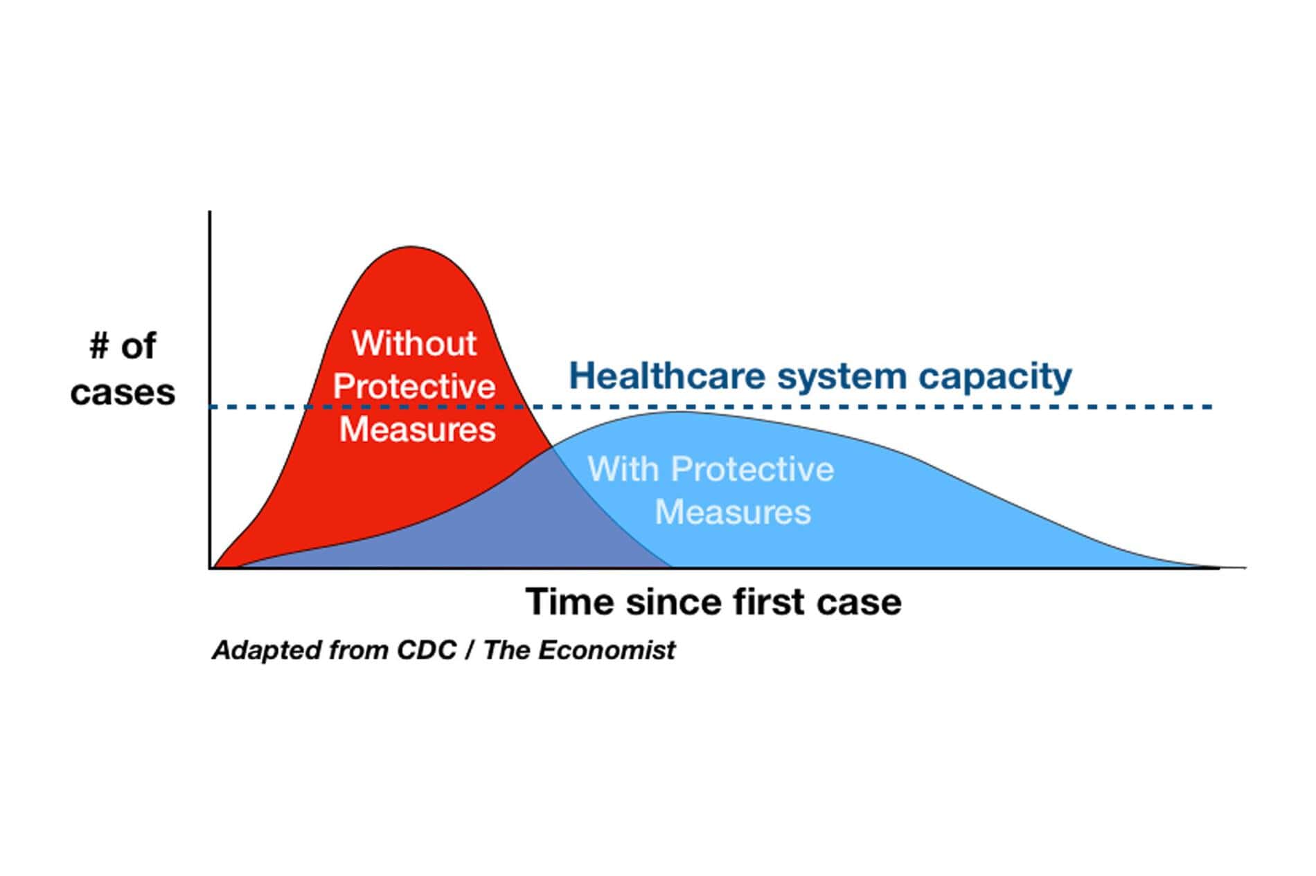
Flattening the curve – a visual metaphor that saves lives
One of the main perils of this virus is that it spreads so quickly, but the speed of its proliferation depends on human behaviour. This is why the ‘epidemic curve’ that describes how many cases there are in a certain area was so important to alert citizens to potential disaster and mobilise them to act more responsibly. This simple graph is very illustrative and summarises the major implication very clearly – we need to ‘flatten’ the curve by staying at home and wearing masks so that the government has more time to increase the capacity of the healthcare system.
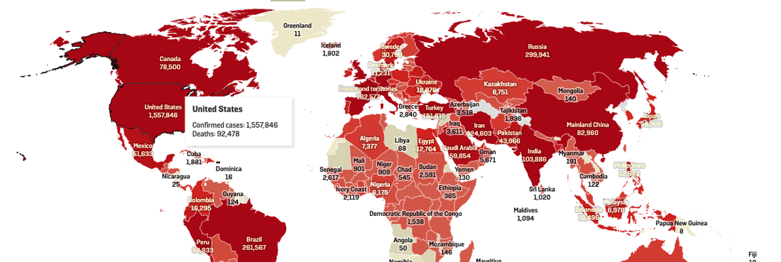
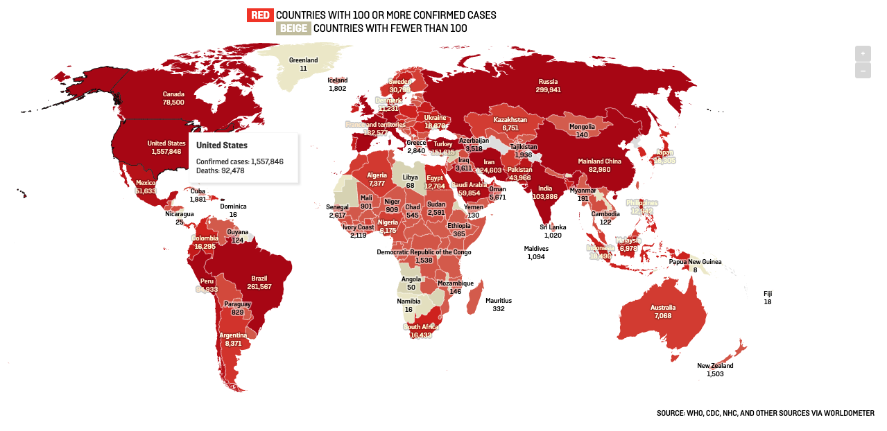
Understanding geographic dispersal through colour-coded maps
Coronavirus tends to spread in clusters and affects some area much more severely than others. For people living in those areas or travelling between them, it’s essential to understand the level of risk and moderate their actions accordingly. One way to do that is by looking at ‘corona maps’ that many media outlets and websites regularly publish, with different towns, regions, or countries represented in different colours depending on the reported number of cases and other parameters. Again, maps of this kind can be used by professionals or citizens and may sometimes be as detailed as to differentiate between various neighbourhoods in the same city. They can also refer to different time periods – global map of the new COVID-19 cases for July looks much different than the one showing the total number of infected people since the start of the pandemic. Because of their flexibility and the ability to convey summarised and well-organised information, maps are indispensable in this type of a situation and may be considered a textbook example how visualisation techniques can find practical applications in seemingly non-technical fields.
One good example of these maps is the worldwide and interactive one on this page from foreignpolicy.com. Here's a screenshot, but the page is worth a visit:
Dynamic mathematical modelling as a prediction tool
Some of the most fundamental predictions in epidemiology are made based on mathematical models, which can be readily visualised through simple techniques. A good example of this approach can be found in simulations of social interactions where dots represent healthy, infected, and immunised people. The Washington Post ran what was probably the most well-known example of this, with real random simulations run in your browser alongside the explanations.
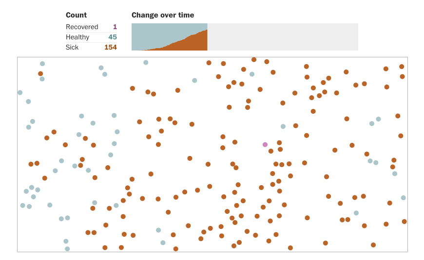
Depending on the rules for movement of the dots, infection rates rise or fall which allows for an approximation of the impact of certain measures (i.e. closure of schools or border quarantines). Jumping dots that change colour as they touch each other are much more fun to watch and easier to comprehend than mathematical formulas and huge data tables, but that’s not all. Most crucially, visual demonstrations are more intuitive and make a dramatic and immediate impact on the viewer, making them ideal when there is a need to get a message across.
Advanced statistical parameters and scientific collaboration
It’s a common misperception that graphs and other visualisation tools can ‘dumb down’ the scientific argument. In reality, scientists can benefit from them as much as anybody, as they typically handle substantial volumes of data that can sometimes be inconsistent or noisy. Presenting the findings in the most optimal format allows medical professionals to understand the true nature of the epidemic in a certain area – for example, logarithmic curves and semi-log plots may be better suited for describing how quickly the virus is spreading than the basic cumulative model. The resulting graphs look very simple, although often some background knowledge is needed in order to understand what they truly mean. Still, this is a great example that proves that visualisation techniques can just as easily be deployed to deepen the insights as to popularise simple facts.
What can data specialists use to help in the fight against COVID?
Without disputing the role that front-line workers and medical professionals are playing in this calamity, technically-minded people can also assist in a meaningful way. Some of the aforementioned uses of data visualisation originated from data analytics specialists who immediately saw a way to contribute in a positive way and amplify the messages coming from the World Health Organization and other credible sources. On the other hand, the tech community could probably do more to debunk myths and conspiracy theories that started proliferating during the epidemic. There is no reason to doubt that data visualisation would be useful for this purpose as well – it’s a powerful tool for demonstrating the facts that could make the illogical nature of such theories apparent.