Tags that this post has been filed under.
There's a certain level of dread that accompanies the build process of a website that'll represent a brand that's all about performance, accessibility, and doing great stuff. The word Prestanda literally means performance in Swedish (performance.co.uk was taken and this word was a good option), but that performance doesn't just mean speed. From the outset, this website needed to perform in a number of areas:
- Speed - how quickly can users get to the information they want?
- Accessibility – can people access the content regardless of device or disability?
- Usability - how can we avoid as much visitor frustration as possible?
- Marketability – how easy is it to spread the word about the site?
- Maintainability – how easy is it for us to stay up to date?
What follows is a few sections on various technology and ethos decisions we made along the way, as well as the things that we know need to improve in the future. Like all websites, we had a deadline for this one, and that meant some of the things we'd have loved to include from the beginning had to take a back seat for now.
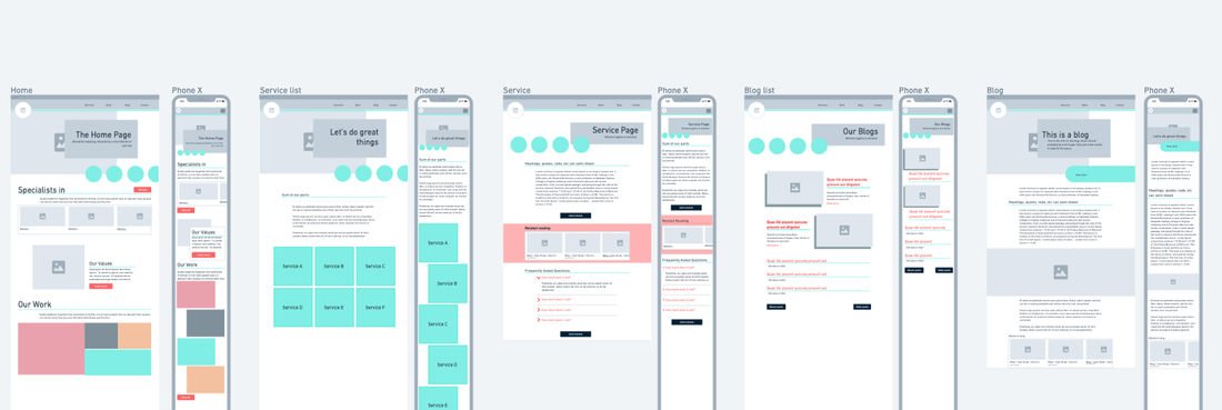
The importance of wireframes
The first step with any website built should be to get some thoughts on content structure out of your head and onto something more tangible. In this case, we started with whimsical and threw down some ideas.
The important point to note here is that when you compare the wireframes to the finished pages you'll see a lot of differences. The idea of the wireframing stage isn't to decide exactly how your website is going to look or be layed out, it's a starting point.
This site is completely static
The first big decision that was made about this site was to build it with a Static Site Generator. Most websites on the Internet these days will work like this:
- A user requests a page
- The server looks up the information needed to generate that page
- The server queries a database to get that information
- The server generates the page
- The server sends the page to the user
- The user's browser paints the page on screen
That process is absolutely fine, and especially so if you're serving up pages that are specific to an individual. Most marketing sites, though, serve the exact same content to each user – and that's where Static Site Generators come in. Using this tech enables us to generate all the possible pages in advance, and reduce the steps above to:
- A user requests a page
- The servers sends the page to the user
- The user's browser paints the page on screen.
By doing that, we've taken out a lot of the relatively time consuming aspects of a page load and made a massive advance towards a speedy website – without the user seeing anything different.
Once we'd decided to go down the static site route, the magnificent Andy Bell of Piccalilli had all the material needed to put together an Eleventy site hosted on Netlify. An added bonus is that this site costs nothing to host.
Requesting as little as possible
If you're so inclined, check the source on a few pages of the site. You'll see that most of the CSS needed to render each page is included right there in the HTML, and the rest (if any) is requested later. This means that, apart from fonts and other assets (like the logo) that are used on most pages, each page will only be requesting whatever images it needs to render fully.
The home page takes 243kB to load at the time of writing. The average total size of a WordPress page in June 2020 was around 10 times that (source).
We're also avoiding using external sources for any assets wherever possible. Keeping your images, scripts and styles all on the same server as the page is being requested from has a huge performance impact by using one connection to one server to render a page.
Accessibility first
Quite rightly, there is a large and growing community of web designers who would like to make sure that everyone who tries to use theirs (and their clients) websites can do so. But accessibility isn't just about making sure that people who have problems with their vision can have your content read to them with their software. It's also about making sure that the elements of a page interact with a user the way they expect. Things like pressing the tab key to navigate between inputs on a contact form, or a dropdown box that asks for your birth month responding to a press of the N button to select Novermber.
Generally the way to achieve this sort of accessibility is just let browsers do what they're built to do. Use the right HTML tags in the right places, in the right ways, and the accessibility mostly sorts itself out. This website does exactly that, and if you find anything that doesn't work the way you expect it to then we want to know about it.
No cookies!
I come from a marketing background, and I hate cookie banners as much as you do. I was dreading having to implement one on the site, and kept putting it off. Then it came to me:

So this website does not use any cookies. That means:
- No Google Analytics (although that doesn't mean we don't have any Analytics at all, we're using Fathom)
- No Facebook tracking
- No Google Ads tracking
- No marketing automation tracking
- In fact, no 'tracking' at all
The marketing of this site will rely on two things instead:
- Producing content and evidence of work that will make you want to get in touch
- Generating great data from other sources for any outbound activity that we do
Whether that works out or not remains to be seen, but I'm confident that we can do a good enough job in both of those areas to avoid a u-turn.
Structured data rules
Every page of this site has a few extra lines of code in the HTML which conform to schema.org definitions, which in turn help various tools to know exactly what that page and it's components are all about.
Take this blog, for instance, which contains something like the following:
<script type="application/ld+json">
    {
        "@context": "https://schema.org",
        "@type": "BlogPosting",
        "mainEntityOfPage": {
            "@type": "WebPage",
            "@id": "https://www.prestanda.co.uk/blog/this-website-how-is-it-built/"
        },
        "headline": "This website: How is it built?",

        "description": "How we approached building a website that we could be proud to share.",

        "speakable": {
            "@type": "SpeakableSpecification",
            "cssSelector": ["#main-content"]
        },

        "keywords": "Website Development",

        "publisher": {
            "@type": "Organization",
            "name": "Prestanda",
            "url": "https://www.prestanda.co.uk"
        },
        "datePublished": "2020-08-14"
    }
</script>
That information all gives extra context to a visitor like Google, or any of the social networks, to help them to digest the information. That's especially true of things like the FAQs on most service pages, which are tagged to help point things like search engines to the answers to questions users might be asking.
Fast doesn't have to mean ugly
OK, this one's subjective, but I really like the look of this site. There's very little in the way of magically appearing text as you scroll (which is both a performance and accessibility issue), and we've focussed quite heavily on straight lines, but those are very much design choices that would have been made regardless of the quest for speed.
There are a few touches to the site that are noteworthy:
- Have you noticed the little animation of the logo at the top of the page?
- Try any page you like on any device screen size you like – I bet the content fits in a usable and digestible way
- There are little touches when you hover over certain aspects of the site, and when you click or tap them
- I personally love the way that headings and images "bleed" outside of the width of the content itself
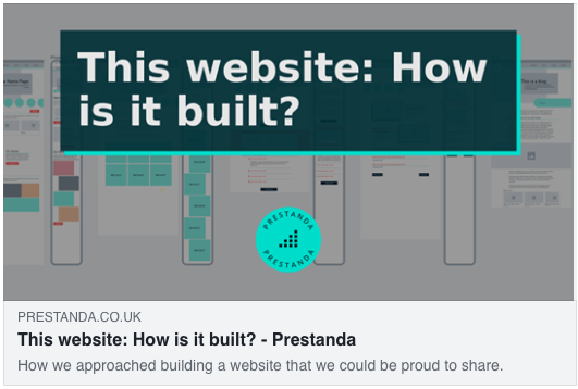
My favourite, though, is definitely the automatically generated social images. Every time a new page on the website is made, or edited, a nicely formatted social image will be generated for it. That means that those who share our content on Facebook will be sharing something that looks very much on-brand like this:
Good enough for now
With all that said, this site is definitely "done, for now". There are some improvements and added features to come in time, but the main aim was to hit a deadline with a site that ticked all those boxes for speed, accessibility, marketability and the rest. We've done that, and now it's time for some client work!